Communications design for corporate merger

Branding, marketing communications package present corporate merger to the financial community
CLIENT:
Solutions Only Financial Technologies and CUTASC
CUTASC (a professional services company) and Solutions Only Financial Technologies (a financial software developer) were both long-time clients for whom we’d developed logo and branding platforms. When the companies merged they needed a way to present their new business relationship to their customers and prospects. Both companies were active participants in industry events and they needed a full marketing package designed quickly that could be used until the new unified company brand could be developed.
Discover & Devise
The two companies had partnered together on several projects in the past, and the merger was a friendly one. They wanted a new treatment that presented both company logos in a way that reflected this spirit of partnership, and the fact that they could now offer their respective clients an end to end solution.
Work on the marketing package began with a branding brainstorm session with the client to review the two distinct brands, confirm the strongest aspects of each and generate concept ideas to portray an image of partnership and strength.
Design & Develop
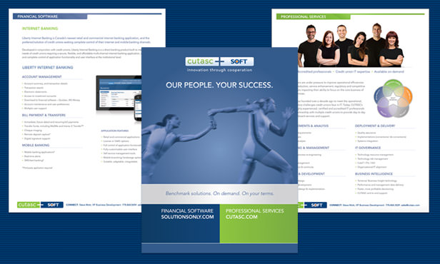
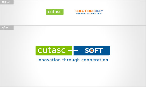
Logo design: The task of combining the two logos presented a creative challenge. Solutions Only Financial Technologies was a lengthy name and CUTASC had a tagline that they wanted to retain. Six treatments were developed for stakeholder review. The treatment chosen retained the lozenge shape of the CUTASC logo and replaced “Solutions Only Financial Technologies” with the acronym “SOFT”, which had already been in use for product branding. The two halves of the treatment were joined by a plus symbol to convey the partnership. Corporate communications templates were quickly updated to incorporate the new logo.
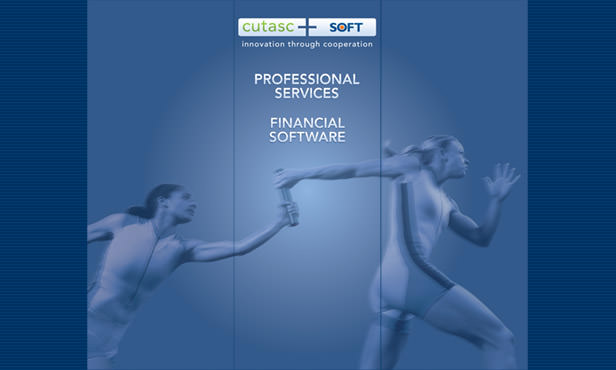
Marketing communications package: Solutions Only had a well-liked theme in place using athletes as a metaphor, and the image of a relay baton pass effectively tied this theme into the concept of partnership. The dominant colours from both brands would be combined into a new colour scheme, and marketing materials would be colour-coded with green to represent CUTASC’s professional services and blue to represent Solutions Only’s software. The package included:
- Trade show banners: CUTASC wanted to retain the hardware they had been using for three vertical banners. The new banner design created a merged scene featuring the relay image.
- Presentation folder with marketing collateral: The presentation folder was designed with colour-blocking to present the professional services and software offerings along with links to the two company websites. Coordinating brochure, software data sheets and a white paper template (created in Microsoft Word for easy updates) completed the package.
Results delivered
The new branding platform and marketing materials effectively introduced the merger to the financial community, and staff and customers responded positively to the new look. Aalto Interactive is currently working on the permanent rebranding of the company.
"I highly recommend Aalto Interactive. From brand identity through to website development, Roanna and Alex have brought a broad and impressive mixture of experience, skill, and creative flair to numerous projects. Projects are delivered on time and within budgets - with a prompt, engaged and professional level of service throughout. Aalto Interactive is a partner that adds value to our business."
- Stephen Mitchell, Marketing Director, CUTASC and Solutions Only Financial Technologies